- Data Sources
- Column Description
- Data Type
- Volume and frequency
- Data Quality – Missing Values or Anomalies
Data Transformation
- Patients Age Groups against waiting list Renaming Columns
- Rearranging Columns
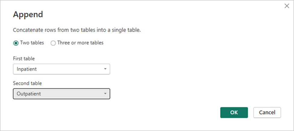
- Appending 2 Tables
- Replacing & trimming values
Renaming Columns
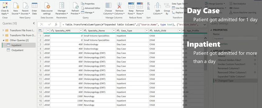
- While studying the data, I noticed that the Specialty column in Inpatient data is named as Specialty_Name, whereas in Outpatient it is named as just Specialty.
- Case_Type which is missing from Outpatient. So lets create one additional column in Outpatient table called Case_Type